Media Kit
Use these official brand resources for press mentions, blog posts, decks, and partner integrations.
Downloads
Section titled “Downloads”- Full Media Kit (ZIP): Download — includes all logo variants (
icon,logotype,icon+logotype, in dark/light), Brand Guideline (PDF), and the site favicon. - Brand Guidelines PDF: View Online — complete brand guidelines document
- Favicon (small): Download
Quick Links
Section titled “Quick Links”- Brand Guidelines — Complete brand standards and usage guidelines
- Media Kit Assets — Logo previews and technical specifications
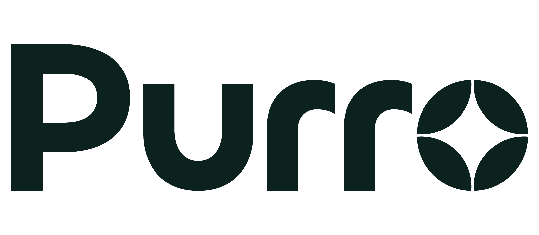
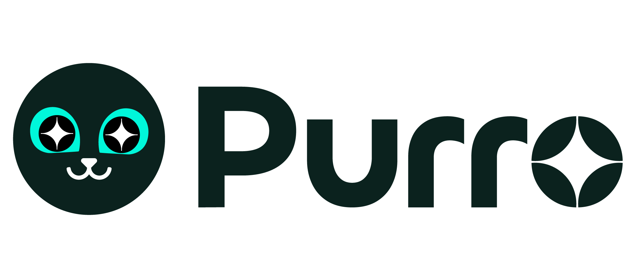
Preview of common variants. Previews use demo backgrounds to ensure visibility; choose dark or light based on your actual background.

Technical Specifications
Section titled “Technical Specifications”- Format: PNG with transparent background (included in kit)
- Minimum size: 128×128 px for digital applications
- Recommended sizes: 256×256 px (standard), 512×512 px (high-res)
- Print usage: Request SVG versions for large-scale printing
- File naming: Use descriptive names (e.g.,
purro-icon-dark.png,purro-logotype-light.png)
Usage Examples
Section titled “Usage Examples”- Social media: Use Icon or Icon+Logotype variants
- Website headers: Logotype or Icon+Logotype work best
- App icons: Use Icon variant only
- Business cards: Icon+Logotype provides good balance
- Large banners: Logotype variant for maximum readability
Brand colors
Section titled “Brand colors”Values reflect both dark and light themes from src/styles/custom.css.
- Primary (accent):
#00f7da(dark) /#004236(light) - Accent low:
#003d2f(dark) /#e6f9f6(light) - Accent high:
#66fae8(dark) /#002a21(light) - Body text:
#ffffff(dark) /#0b221e(light)
Color swatches
Section titled “Color swatches”#00f7da
#003d2f
#66fae8
#004236
#e6f9f6
Typography
Section titled “Typography”- Primary typeface: Figtree from Google Fonts
- Weights available: Light (300), Regular (400), Medium (500), SemiBold (600), Bold (700), Black (900)
- Usage: Use Figtree for all brand communications, headings, and body text
- Fallbacks: When Figtree is unavailable, use system fallbacks:
-apple-system, BlinkMacSystemFont, 'Segoe UI', Roboto, sans-serif - Implementation: Include via Google Fonts CDN or self-host for better performance
Brand guidelines
Section titled “Brand guidelines”Logo Usage
Section titled “Logo Usage”- Contrast: Always maintain strong contrast — use light logo variants on dark backgrounds and dark variants on light backgrounds
- Integrity: Never distort, rotate, skew, or recolor the logo
- Clear space: Maintain minimum clear space around the logo equal to 1× the icon width on all sides
- Minimum size: Never use logos smaller than 128×128 px for digital applications
- Effects: Avoid drop shadows, gradients, or effects that reduce legibility
Color Usage
Section titled “Color Usage”- Use only the approved color palette shown above
- Ensure sufficient contrast ratios for accessibility (4.5:1 minimum for text)
- Primary accent color should be used sparingly for emphasis
- Body text colors are optimized for readability in both light and dark themes
Typography Guidelines
Section titled “Typography Guidelines”- Use Figtree for all brand communications
- Maintain consistent hierarchy: headings, subheadings, body text
- Ensure proper line spacing (1.4-1.6 line height recommended)
- Keep line lengths readable (45-75 characters per line)
What NOT to do
Section titled “What NOT to do”- Don’t place logos on busy backgrounds without proper contrast
- Don’t use unapproved colors or create new color combinations
- Don’t mix Purro branding with other brand elements
- Don’t use outdated logo versions or create custom variations
For complete guidelines, refer to our Brand Guidelines page or the included “Brand Guideline.pdf” in the media kit.